Showing posts with label statistics. Show all posts
Showing posts with label statistics. Show all posts
Sunday, November 25, 2012
R Blogs
A reminder about two good R blogs:
http://rforpublichealth.blogspot.com/
http://diffuseprior.wordpress.com/

Wednesday, January 05, 2011
January 5th Links
1. For those interested in maximum likelihood estimation techniques, Vincent Granville discusses the method of steepest ascent in relation to Google's search algorithm.
2. The Economist: "Only a few fast-developing countries, such as Brazil and China, now seem short of PhDs."
3. U.S. Council of Graduate Schools: The Ph.D. Completion Project
4. Yesterday it was announced that Irish property prices fell back to 2002 levels in 2010, according to reports from MyHome.ie and Sherry Fitzgerald; so it is interesting to read this SSISI paper (2007) by P.J. Drudy which "argues that Ireland’s housing problems stem in part from a particular philosophical orientation which supports the 'commodification' of housing".
5. The (U.K.) Royal Statistical Society "Get Stats" Campaign: 'giving everyone the skills and confidence to use numbers well'.
6. Researchers at Harvard have found a way of using the iPhone to measure people’s moods and have found a correlation between daydreaming and unhappiness.
7. The new Happiness Index to gauge Britain's national mood.
8. The regional impacts of Northern Irish HEIs.
9. Tom McKenzie and Dirk Sliwka: Universities as Stakeholders in their Students' Careers: On the Benefits of Graduate Taxes to Finance Higher Education.
10. CNN Money: Should companies offer sabbaticals?
11. Damien Mulley: "Failure" and Enterprise Culture in Ireland.
2. The Economist: "Only a few fast-developing countries, such as Brazil and China, now seem short of PhDs."
3. U.S. Council of Graduate Schools: The Ph.D. Completion Project
4. Yesterday it was announced that Irish property prices fell back to 2002 levels in 2010, according to reports from MyHome.ie and Sherry Fitzgerald; so it is interesting to read this SSISI paper (2007) by P.J. Drudy which "argues that Ireland’s housing problems stem in part from a particular philosophical orientation which supports the 'commodification' of housing".
5. The (U.K.) Royal Statistical Society "Get Stats" Campaign: 'giving everyone the skills and confidence to use numbers well'.
6. Researchers at Harvard have found a way of using the iPhone to measure people’s moods and have found a correlation between daydreaming and unhappiness.
7. The new Happiness Index to gauge Britain's national mood.
8. The regional impacts of Northern Irish HEIs.
9. Tom McKenzie and Dirk Sliwka: Universities as Stakeholders in their Students' Careers: On the Benefits of Graduate Taxes to Finance Higher Education.
10. CNN Money: Should companies offer sabbaticals?
11. Damien Mulley: "Failure" and Enterprise Culture in Ireland.
Friday, December 17, 2010
Monday, March 22, 2010
Time for t? Do we misinterpret statistical significance?
The use & mis-use of significance tests is discussed occasionally, perhaps not enough, in the economics literature. McCloskey & Ziliak are well known critics of the use of t statistics in economics & elsewhere. Given that the humble t statistic is a Dublin invention (Gosset a.k.a. "Student" was chief brewer at Guinness' Brewery) there is also a certain local interest in this too.
This recent paper by Siegfried, which is strongly critical of how significance tests are used, is well worth a read in this regard.
http://www.sciencenews.org/view/feature/id/57091/title/Odds_are,_its_wrong
This recent paper by Siegfried, which is strongly critical of how significance tests are used, is well worth a read in this regard.
http://www.sciencenews.org/view/feature/id/57091/title/Odds_are,_its_wrong
Tuesday, March 16, 2010
It Was Unacceptable in the 80's...
...and it also is now. The U.S. unemployment rate that is. The graph below shows that the current unemployment rate in the U.S. (9.7%) has not yet reached the same level that it was at in the U.S. recession of the early 1980's. Of course, one should be careful with language: the U.S. unemployment rate may not return to the same level as the early 1980's. Indeed, the graph indicates that a corner may have been turned; and there was good news last week about a decline in U.S. jobless claims. However, caution is still required; U.S. Treasury Secretary Timothy Geithner today warned jobless Americans that they face a torrid year ahead, predicting continued high unemployment levels despite advances 'sometime this spring'.
Note: The graph below is taken from the visualisation service provided by the St. Louis Federal Reserve Economic Database (FRED®): a database of 20,478 U.S. economic time series. With FRED® one can download data in Microsoft Excel and text formats; and view charts of data series.

What about the unemployment situation in Europe? The graph below (generated using Google Public Data) shows seasonally adjusted unemployment rates for a random selection of countries in Europe. The unemployment rate represents unemployed persons as a percentage of the labour force. The labour force is the total number of people employed and unemployed. More details about calculation are available here from Eurostat.
We can see that the European Union unemployment rate (9.5%) is very similar to that of the United States. The Spanish unemployment rate (18.8%) is roughly six times as large as the Norwegian unemployment rate (3.2%). Denmark, which was in a very similar employment scenario to Norway at the start of 2006, has fared worse during the recession: it now has an unemployment rate of 7.3%. How did Norway avoid the labour market deterioration that happened in Denmark? Also, the drop in the Polish unemployment rate (from 20.3% in 2002) is quite startling; even now, the Polish unemployment rate is only 8.9%.
Ireland, with an unemployment rate of 13.4%, is faring almost 4 percentage points (in some cases much more) worse than Portugal, France, Greece, Germany, Finland, Poland, Italy, Bulgaria, the Czech Republic, the United Kingdom, Denmark and Romania (some countries not shown on the graph for illustraive parsimony). Why is the unemployment rate in Ireland worse than in all of the European countries mentioned above?
Obviously, one is now wondering: I thought the unemployment rate in Ireland is 12.4%? As indicated by the latest monthly figure from the Live Register (which we know is not intended to measure unemployment). It seems that Eurostat are taking a measure of labour market distress for each country: a measure that I blogged about before: here. I noted that by taking account of individuals (in the QNHS - the official measure of unemployment) who are 'part-time under-employed', we get an overall measure of labour market distress. I will be investigating the Eurostat calculations further; but prima facie, it seems that they are calculating a measure of labour market distress. It is also possible to account for individuals who are 'marginally attached to the labour force', which raises the rate of labour market distress further.
Note: The graph below is taken from the visualisation service provided by the St. Louis Federal Reserve Economic Database (FRED®): a database of 20,478 U.S. economic time series. With FRED® one can download data in Microsoft Excel and text formats; and view charts of data series.

What about the unemployment situation in Europe? The graph below (generated using Google Public Data) shows seasonally adjusted unemployment rates for a random selection of countries in Europe. The unemployment rate represents unemployed persons as a percentage of the labour force. The labour force is the total number of people employed and unemployed. More details about calculation are available here from Eurostat.
We can see that the European Union unemployment rate (9.5%) is very similar to that of the United States. The Spanish unemployment rate (18.8%) is roughly six times as large as the Norwegian unemployment rate (3.2%). Denmark, which was in a very similar employment scenario to Norway at the start of 2006, has fared worse during the recession: it now has an unemployment rate of 7.3%. How did Norway avoid the labour market deterioration that happened in Denmark? Also, the drop in the Polish unemployment rate (from 20.3% in 2002) is quite startling; even now, the Polish unemployment rate is only 8.9%.
Ireland, with an unemployment rate of 13.4%, is faring almost 4 percentage points (in some cases much more) worse than Portugal, France, Greece, Germany, Finland, Poland, Italy, Bulgaria, the Czech Republic, the United Kingdom, Denmark and Romania (some countries not shown on the graph for illustraive parsimony). Why is the unemployment rate in Ireland worse than in all of the European countries mentioned above?
Obviously, one is now wondering: I thought the unemployment rate in Ireland is 12.4%? As indicated by the latest monthly figure from the Live Register (which we know is not intended to measure unemployment). It seems that Eurostat are taking a measure of labour market distress for each country: a measure that I blogged about before: here. I noted that by taking account of individuals (in the QNHS - the official measure of unemployment) who are 'part-time under-employed', we get an overall measure of labour market distress. I will be investigating the Eurostat calculations further; but prima facie, it seems that they are calculating a measure of labour market distress. It is also possible to account for individuals who are 'marginally attached to the labour force', which raises the rate of labour market distress further.
Monday, March 08, 2010
How Google Does Business...
1. "What could be more baffling than a capitalist corporation that gives away its best services, doesn't set the prices for the ads that support it, and turns away customers because their ads don't measure up to its complex formulas?". Read how economics underlies every aspect of the Google business model: here in Wired.
2. AdWords is a pioneering variation on a second-price auction.
3. AdWords was such a hit that Google used auctions to place ads on other websites: AdSense.
4. Hal Varian, Chief Economist at Google, has been mentioned on the blog before: here and here.
5. "But the really gutsy move," Hal Varian says, "was using it in the IPO." In 2004, Google used a variation of a Dutch auction for its initial public offering.
6. The Google equivalent of the Consumer Price Index is called the Keyword Pricing Index. Here's a link about Fathom Online's version. Examples of very competitive keywords are 'flowers' and 'hotels'.
7. Quality Scores are important: a penalty is invoked when the ad quality is too low. In such cases, the company slaps a minimum bid on the advertiser.
8. Hal Varian says: "The people working for me are generally econometricians—sort of a cross between statisticians and economists". He's currently hiring a senior economist. The London office also has other opportunities.
2. AdWords is a pioneering variation on a second-price auction.
3. AdWords was such a hit that Google used auctions to place ads on other websites: AdSense.
4. Hal Varian, Chief Economist at Google, has been mentioned on the blog before: here and here.
5. "But the really gutsy move," Hal Varian says, "was using it in the IPO." In 2004, Google used a variation of a Dutch auction for its initial public offering.
6. The Google equivalent of the Consumer Price Index is called the Keyword Pricing Index. Here's a link about Fathom Online's version. Examples of very competitive keywords are 'flowers' and 'hotels'.
7. Quality Scores are important: a penalty is invoked when the ad quality is too low. In such cases, the company slaps a minimum bid on the advertiser.
8. Hal Varian says: "The people working for me are generally econometricians—sort of a cross between statisticians and economists". He's currently hiring a senior economist. The London office also has other opportunities.
Sunday, March 07, 2010
Some Links
1. Do we need a "jobs czar"?
2. Chris Horn on the Irish Economy
3. The L.A. Times on the Irish Economy
4. The Collaborative on Academic Careers in Higher Education (COACHE)
5. Seeking Alpha on last Thursday's U.S. jobless claims report; the story features some graphs from Blytic.com that are worth checking out
6. The Smart Data Collective: The Data-Driven Enterprise Community; their blog recently featured a critical review of McKinsey's guide to behavioural economics for marketers
7. Intelligent Enterprise: "Possibly the most important factor influencing the spread of predictive analytics is the growing popularity of R... Vendors, including IBM SPSS, Information Builders and SAS are incorporating R." More here.
2. Chris Horn on the Irish Economy
3. The L.A. Times on the Irish Economy
4. The Collaborative on Academic Careers in Higher Education (COACHE)
5. Seeking Alpha on last Thursday's U.S. jobless claims report; the story features some graphs from Blytic.com that are worth checking out
6. The Smart Data Collective: The Data-Driven Enterprise Community; their blog recently featured a critical review of McKinsey's guide to behavioural economics for marketers
7. Intelligent Enterprise: "Possibly the most important factor influencing the spread of predictive analytics is the growing popularity of R... Vendors, including IBM SPSS, Information Builders and SAS are incorporating R." More here.
Tuesday, February 02, 2010
WePredict
Using Twitter for macro-level analysis has been discussed on the blog before:
(i) Sample Selection, Twitter's Public Timeline, TweetScan and Quotably
(ii) Twilert (re-launched this month), Summize Labs, Twitter's acquisition of Summize
(iii) Life Analytics: Sentiment on the United States Economy
(iv) The Google-Index of Social Media, and the apparent superiority of Bing for deciphering real-time breaking trends
So it was interesting to read a recent article in the Irish Times about two students who used Twitter to predict that Joe McElderry would win the recent X-Factor competition... before the results were announced. "Ben McRedmond (17) and Patrick O’Doherty (16), two fifth years from Gonzaga College, Dublin demonstrated the power of their social networking analysis system, We Predict, at the BT Young Scientist and Technology Exhibition. It was developed over more than five months and is based on storing and studying a growing database of 24.5 million tweets which hold clues about what people are thinking."
A quick search led me to the WePredict website. The information there states that: "WePredict is a showcase of several technologies we have built: a data mining application, capable of mining data from multiple social networks; and a complex suite of analysis tools for analyzing this data...WePredict's large database of over 22 million status updates growing at 20 a second makes it the largest user survey ever done... using the collective intelligence of the whole internet, a mere 1.5 billion people, we can predict the outcomes of elections, talent shows or who will be the christmas #1 and analyze the public reaction to new legislation or medical epidemics."
An exciting endeavour such as this one reminds me of Hal Varian's famous quote that "the sexy job in the next ten years will be statisticians." A two-minute YouTube clip of Google's Chief Economist is shown below, discussing this very issue.
(i) Sample Selection, Twitter's Public Timeline, TweetScan and Quotably
(ii) Twilert (re-launched this month), Summize Labs, Twitter's acquisition of Summize
(iii) Life Analytics: Sentiment on the United States Economy
(iv) The Google-Index of Social Media, and the apparent superiority of Bing for deciphering real-time breaking trends
So it was interesting to read a recent article in the Irish Times about two students who used Twitter to predict that Joe McElderry would win the recent X-Factor competition... before the results were announced. "Ben McRedmond (17) and Patrick O’Doherty (16), two fifth years from Gonzaga College, Dublin demonstrated the power of their social networking analysis system, We Predict, at the BT Young Scientist and Technology Exhibition. It was developed over more than five months and is based on storing and studying a growing database of 24.5 million tweets which hold clues about what people are thinking."
A quick search led me to the WePredict website. The information there states that: "WePredict is a showcase of several technologies we have built: a data mining application, capable of mining data from multiple social networks; and a complex suite of analysis tools for analyzing this data...WePredict's large database of over 22 million status updates growing at 20 a second makes it the largest user survey ever done... using the collective intelligence of the whole internet, a mere 1.5 billion people, we can predict the outcomes of elections, talent shows or who will be the christmas #1 and analyze the public reaction to new legislation or medical epidemics."
An exciting endeavour such as this one reminds me of Hal Varian's famous quote that "the sexy job in the next ten years will be statisticians." A two-minute YouTube clip of Google's Chief Economist is shown below, discussing this very issue.
Friday, January 08, 2010
Facebook Research
Day-of-the-week effects have been mentioned on the blog before, including research by Gerard O Neill from Amarach Consulting. A recent article in the New York Times reports that "there is a 9.7 percent increase in happiness on Fridays compared with the worst day of the week, Monday. That is among the discoveries made by Facebook researchers with access to two years of anonymous “status updates” from 100 million users in the United States."
The Facebook Global Happinness Index (from www.ourkitchensink.com) is shown below. The Facebook Research page related to this index is available here. The Happiness Index is based on the Linguistic Inquiry and Word Count (LIWC).

Updates from Facebook's data-team can be accessed here. The Top 15 status terms of 2009 can be viewed here. Analysis of maintained relationships on Facebook can be viewed here. With more data than ever available through the rise of Web 2.0, the Flowing Data blog suggests that we may see the rise of the "data-scientist".
The Facebook Global Happinness Index (from www.ourkitchensink.com) is shown below. The Facebook Research page related to this index is available here. The Happiness Index is based on the Linguistic Inquiry and Word Count (LIWC).

Updates from Facebook's data-team can be accessed here. The Top 15 status terms of 2009 can be viewed here. Analysis of maintained relationships on Facebook can be viewed here. With more data than ever available through the rise of Web 2.0, the Flowing Data blog suggests that we may see the rise of the "data-scientist".
Graphs in statistics
Florence Nightingale is best known for her sterling work, as a nurse, improving the health conditions of British soldiers in the Crimea by improving hygiene for example. her contributions to statistics are less well known but important. She developed graphical methods for illustrating public health statistics for UK members of parliament- not the brightest of people in general and was able to use observational studies to show the effect of improved hygiene in field hospitals on mortality. She developed a version of the pie chart.
To remind you of what a good pie chart looks like I have given an example (h/t the Laughing Squid)

To remind you of what a good pie chart looks like I have given an example (h/t the Laughing Squid)

Wednesday, January 06, 2010
Round-Up of News from the CSO
1. An Administrative Data Seminar will be held on February 22nd; the seminar programme is available here.
2. The Irish Government decided on 11 December 2009 that the 2011 census will take place on Sunday 10 April 2011. The Government also decided to include the following questions on the Census 2011 household form. Readers may be interested to know that the next census will provide information on general health status.
3. The Census Pilot Survey was conducted on the 19th April 2009. The accompanying report is available here.
4. Tomorrow, information will be released on County Incomes and Regional GDP for 2007.
5. On Friday, the Live Register information for December will be released.
2. The Irish Government decided on 11 December 2009 that the 2011 census will take place on Sunday 10 April 2011. The Government also decided to include the following questions on the Census 2011 household form. Readers may be interested to know that the next census will provide information on general health status.
3. The Census Pilot Survey was conducted on the 19th April 2009. The accompanying report is available here.
4. Tomorrow, information will be released on County Incomes and Regional GDP for 2007.
5. On Friday, the Live Register information for December will be released.
Monday, November 30, 2009
Stats is Cool, Yet Again
This is an article from a couple of months ago in the NY Times; recommending the benefits of a grounding in statistics for graduate students.
Thursday, November 19, 2009
CSO Releases
Thanks to Michael E. and others for pointing out a number of important CSO releases including the Statistical Year Book for 2009 and the results of the 2008 SILC survey. The major changes in construction, prices and employment mark the Year Book out as a historic document though the figures refer to 2008 mostly so do not encapsulate the stark collapses witnessed throughout this year. Even so, ample proof that we are living in interesting times.
link here
link here
Sunday, November 01, 2009
Mind the gap
Gapminder http://www.gapminder.org/ is a very useful web site for presenting comparative statistical data on a range of topics. For example you get it show infant mortality & GDP evolving in Ireland. Its very impressive.
Sunday, October 11, 2009
Statistical challenges in estimating small effects
This is a really nice piece by Gelman & Weakliem which makes important points about the power of tests when estimating small effects with an application to "evolutionary psychology" [or bad science in this case].
http://www.americanscientist.org/issues/feature/2009/4/of-beauty-sex-and-power
http://www.americanscientist.org/issues/feature/2009/4/of-beauty-sex-and-power
Monday, September 21, 2009
$500,000 Prize for the Best "Taste Profile" Model
In today's New York Times, there is a story about Netflix, the movie rental company, and how they awarded a $1 Million Prize for a statistical model. The company decided its million-dollar competition was such a good investment that it is planning another one.
The company’s challenge, begun in October 2006, was to come up with a recommendation software that could do a better job accurately predicting the movies customers would like than Netflix’s in-house software, Cinematch. To qualify for the prize, entries had to be at least 10 percent better than Cinematch.
The data set for the first contest was 100 million movie ratings, with the personally identifying information stripped off. Contestants worked with the data to try to predict what movies particular customers would prefer, and then their predictions were compared with how the customers actually did rate those movies later, on a scale of one to five stars.
The new contest is going to present the contestants with demographic and behavioral data, and they will be asked to model individuals’ “taste profiles,” the company said. The data set of more than 100 million entries will include information about renters’ ages, gender, ZIP codes, genre ratings and previously chosen movies. Unlike the first challenge, the contest will have no specific accuracy target. Instead, $500,000 will be awarded to the team in the lead after six months, and $500,000 to the leader after 18 months.
The company’s challenge, begun in October 2006, was to come up with a recommendation software that could do a better job accurately predicting the movies customers would like than Netflix’s in-house software, Cinematch. To qualify for the prize, entries had to be at least 10 percent better than Cinematch.
The data set for the first contest was 100 million movie ratings, with the personally identifying information stripped off. Contestants worked with the data to try to predict what movies particular customers would prefer, and then their predictions were compared with how the customers actually did rate those movies later, on a scale of one to five stars.
The new contest is going to present the contestants with demographic and behavioral data, and they will be asked to model individuals’ “taste profiles,” the company said. The data set of more than 100 million entries will include information about renters’ ages, gender, ZIP codes, genre ratings and previously chosen movies. Unlike the first challenge, the contest will have no specific accuracy target. Instead, $500,000 will be awarded to the team in the lead after six months, and $500,000 to the leader after 18 months.
Friday, August 07, 2009
Be Careful with Your Control Variables!
I'm doing a session in the Geary Journal Club on being ''Careful with Your Control Variables'', at 3pm on Friday 9th October. The main paper is "The Phantom Menace", but there are two more that can be read for the session, as indicated below.
1. Kevin Clarke (Rochester): "The Phantom Menace: Omitted Variable Bias in Econometric Research", Conflict Management and Peace Science, 22:341–352, 2005
2. Chris Achen (Princeton): "Let’s Put Garbage-Can Regressions and Garbage-Can Probits Where They Belong", Conflict Management and Peace Science, 22:327–339, 2005
3. Oneal and Russett (Yale): "Rule of Three, Let It Be? When More Really Is Better", Conflict Management and Peace Science, 22:293–310, 2005
1. Kevin Clarke (Rochester): "The Phantom Menace: Omitted Variable Bias in Econometric Research", Conflict Management and Peace Science, 22:341–352, 2005
2. Chris Achen (Princeton): "Let’s Put Garbage-Can Regressions and Garbage-Can Probits Where They Belong", Conflict Management and Peace Science, 22:327–339, 2005
3. Oneal and Russett (Yale): "Rule of Three, Let It Be? When More Really Is Better", Conflict Management and Peace Science, 22:293–310, 2005
Saturday, August 01, 2009
Stats Cool Graphs
Thanks to Olivia Joyner for sending on a link to GapMinder.org. Their mission statement is "unveiling the beauty of statistics for a fact based world view."
Thursday, June 11, 2009
Why Researchers Should Always Check for Outliers, and What To Do About Them
"Researchers rarely report checking for outliers of any sort. This inference is supported empirically by Osborne, Christiansen, and Gunter (2001), who found that authors reported testing assumptions of the statistical procedure(s) used in their studies--including checking for the presence of outliers--only 8% of the time. Given what we know of the importance of assumptions to accuracy of estimates and error rates, this in itself is alarming. There is no reason to believe that the situation is different in other social science disciplines."
This quote is taken from a peer-reviewed electronic journal article on outliers by Osborne and Overbay (2004), both based at North Carolina State University.
Why do we care? The presence of outliers can lead to inflated error rates and substantial distortions of parameter estimates (e.g., Zimmerman, 1994, 1995, 1998). If non-randomly distributed (which is vert possible with survey data), they can decrease normality (and in multivariate analyses, violate assumptions of sphericity and multivariate normality), altering the odds of making both Type I and Type II errors. They can seriously bias or influence estimates that may be of substantive interest (for more information on these issues, see Rasmussen, 1988; Schwager & Margolin, 1982; Zimmerman, 1994).
What are outliers? An outlier is generally considered to be a data point that is far outside the "norm" for a variable or population (e.g., Jarrell, 1994; Rasmussen, 1988; Stevens, 1984). Hawkins described an outlier as an observation that “deviates so much from other observations as to arouse suspicions that it was generated by a different mechanism” (Hawkins, 1980). Outliers have also been defined as values that are “dubious in the eyes of the researcher” (Dixon, 1950).
Where do outliers come from? All of the below are described in detail in the Osborne and Overbay paper:
(i) Outliers from data errors
(ii) Outliers from intentional or motivated mis-reporting
(iii) Outliers from sampling error
(iv) Outliers from standardization failure
(v) Outliers from faulty distributional assumptions
(vi) Outliers as legitimate cases sampled from the correct population
(vii) Outliers as potential focus of inquiry
How do we identify them? Simple rules of thumb (e.g., data points three or more standard deviations from the mean) are good starting points. Some researchers prefer visual inspection of the data.
How do we deal with them? What to do depends in large part on why an outlier is in the data in the first place. Where outliers are illegitimately included in the data, it is only common sense that those data points should be removed. One means of accommodating outliers is the use of transformations. By using transformations, extreme scores can be kept in the data set, and the relative ranking of scores remains, yet the skew and error variance present in the variable(s) can be reduced (Hamilton, 1992). One alternative to transformation is truncation, wherein extreme scores are recoded to the highest (or lowest) reasonable score.
Instead of transformations or truncation, researchers sometimes use various “robust” procedures to protect their data from being distorted by the presence of outliers. These techniques “accommodate the outliers at no serious inconvenience—or are robust against the presence of outliers” (Barnett & Lewis, 1994). A common robust estimation method for univariate distributions involves the use of a trimmed mean, which is calculated by temporarily eliminating extreme observations at both ends of the sample (Anscombe, 1960). Alternatively, researchers may choose to compute a Windsorized mean, for which the highest and lowest observations are temporarily censored, and replaced with adjacent values from the remaining data (Barnett & Lewis, 1994).
All the references to the articles mentioned above are available in the Osborne and Overbay paper.
Wednesday, March 11, 2009
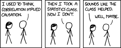
Correlation is not Causation
This cartoon is too good not to put up here aswell. Thanks to Aleks Jakulin from the Columbia Statistics Blog for sharing it. For a discussion on the issue, follow this link to the Columbia Statistics Blog.

Subscribe to:
Posts (Atom)