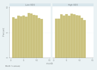
 Liam's post below points to differing patterns in the seasonality of birth by family background. Using PISA 2000, I plot month of birth according to the data's measure of SES - using a median split.
There does appear to be differences although they don't look dramatic to me. Around Autumn/Fall they seem fairly similar and this is usually when the cut-off dates for school entry are.
3 comments:
Interesting graph Kevin. Though, as you know, it is hard to just use an eyeball to work this out as the results in these papers are generally using large-sample type results and relying on fairly fine differences - this is one of the critiques.
Yes, I'm sure the differences are "statistically significant" but then n=160,000 I think. But if you want to know whether the differences are significant in a more meaningful way, eyeballing is not bad.
not using this data, but any big non-US datasets to hand to graph years of schooling by month of birth?
Post a Comment